

Website Development and Justification


From my old website, I made a few changes to the top bar.
Firstly, I had added a YouTube logo under my website to link my channel. This
will make it easier for any viewers to check out my video work. I have also
moved the positioning of the text with ‘Rikhil Majithia’ and ‘Photographer and
Videographer’ which is now in a more suitable position and is easier to read
than where it was positioned before.
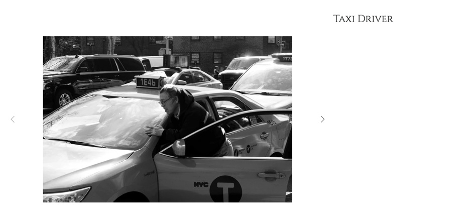
I have also added a new tab. ‘New York’. This includes my
images from my first trip to New York with the university. Once my images from
the second trip have been edited, I will carefully select the best images from
the trip and upload the best shots. This will allow other people to research my
work and they may use it for their research.
I have also used one of my videos for the home page, playing
on a loop. I used my crystal ball video as it is one of my most popular videos
with nearly 2000 views on YouTube. However, using my footage from filming
videos for ‘Ibbies World’ I will make a little showreel and have it on a loop
for the home page to entice the audience viewing my website. This could
potentially lead to receiving job offers in the YouTube industry in the future. The only issue with this, is that Wix are currently working on background videos with sound, so at this moment in time, the looped showreel will not have any sound.

This is a gallery I created on Wix. I decided to go with
this cool and funky slideshow of a small portfolio of what my interests are.
The slideshow is something different to what you usually see and therefore I
went ahead with this choice. I wanted to present my work in a different style
to most photographers and I think this gallery style showcases my photography
style.
For the New York photographs, I
decided to have a gallery, in which once clicked, it opens up into a bigger
file with a caption. This makes it easier for the viewers to view the
photographs. The captions are a small title describing the image. I didn’t want
to write too much about each photo, keeping it quick and simple. The simple
side of things matches my editing style and how I work as a photographer.

I then decided to use
a different style gallery. This one is more common to my portfolio gallery.
This one is more common because you are able to view an image at a decent size
whilst being able to see the other images as a little thumbnail. It is also easier
to navigate as it scrolls down and you can click and choose the image you want
to view.

I have my own blog using blogger and I found a way to link
my blog into my website and have it as another tab for the audience. This will
boost up my blog numbers and also get more coverage globally. There wasn’t much
choice of how the blog looks on the website. It would be nice if you could see
the image on this screen, but wasn’t an option. However, it does mean they have
to click on the individual blog posts to read my blog and view the images from
each post.

We had a seminar around websites.
One piece of information that was useful was not to mention I am a current
student at De Montfort University so I had removed some text to make myself
sound more professional rather than a student. If a potential client found out
that I’m a current student then, this would give them an advantage when booking
me for any jobs. Instead of paying, they could just promote my social media
rather than paying for the job and that puts me at a loss.

One final change I had made to my website was finally purchasing a domain name. Unfortunately www.autofocusphotography.co.uk was taken so I was at a standstill, stuck between two domain names. They were autofocusphoto.co.uk or my name - rikhilmajithia.co.uk. In the end, I decided to go for autofocusphoto as it is easier to spell, type, and matches my instagram username. However, in the future, if anything ever happens to my business and I end up changing the whole brand, I can always purchase my name as the domain as it is a unique name,

One final change I had made to my website was finally purchasing a domain name. Unfortunately www.autofocusphotography.co.uk was taken so I was at a standstill, stuck between two domain names. They were autofocusphoto.co.uk or my name - rikhilmajithia.co.uk. In the end, I decided to go for autofocusphoto as it is easier to spell, type, and matches my instagram username. However, in the future, if anything ever happens to my business and I end up changing the whole brand, I can always purchase my name as the domain as it is a unique name,
I believe my website matches my personality as a photographer. Simple but also complicated in different ways. I wanted to keep the colour scheme, the fonts all simple and suitable for my business. I would then keep this colour scheme for any extras such as business cards, like a uniform. Everything I updated, changed and removed from when my website went live last was for a reason. I had new images to show, removed text to make myself sound more professional and made text clearer to read.
No comments:
Post a Comment